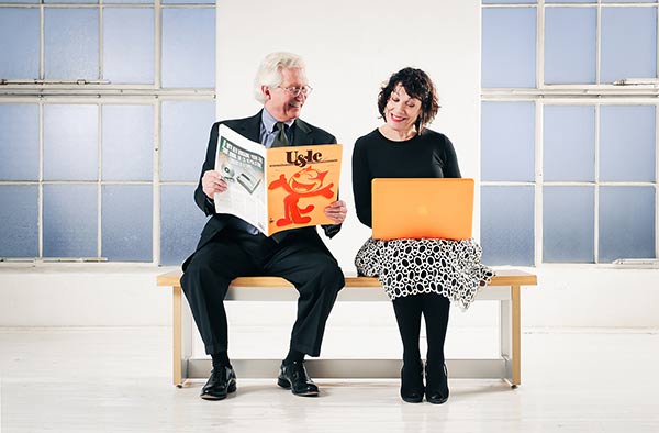
Marian Halliday, recipient of the 2011 AIGA Colorado Fellow award, asked her fellow Fellows to reflect back on 25 years of design in Colorado. This week we take a look back with 2013 Fellow award winner Deborah Williams:

Deborah Williams hanging out with her fellow Fellow award winner John Kjos (photo by: Jason Hayes)
My design career began back in 1970. To put things in perspective, I got my entry level job at Design and Image as a layout artist because I passed a test that included my skill at the following:
- Render a perfect 2 inch square box with 1/4” radius corners using a 4×0 Rapidograph pen, a ruler and a circle template.
- Press type my full name in 36 pt. Helvetica bold using Letraset 36 pt. (with perfect kerning).
- Cut apart a 20 letter word “typeset” in 6 pt. type and paste it together backwards retaining a perfect baseline.
Because we were a design firm rooted in the Bauhaus we had some very strict “rules” that I did grow so weary of…
Headlines as a Design Element
The length of the headline and how it filled or did not fill the space dictated that the headline might need to be rewritten for the sake of the layout. Seriously, this happened. 99% of this was involved using Helvetica and 100% of it involved the grid. See next item:
The Grid
Every project we worked on followed a grid that had to be carefully drawn out on illustration boards. It was where the type lived and you could not violate the grid.
She OD’d on Helvetica
When the founder of Design and Image died (many years after she left the company), her sister called me (I was D&I’s president) and asked for Donna’s logo for the tombstone. I explained there was no logo, merely a logotype. At D&I in the 70’s I don’t think we used another font for 10 years except for the slight variance between Helvetica Regular and Helvetica Medium. Therefore, I suggested that her tombstone be set in Helvetica Medium, flush left, ragged right. And they did it! (tee hee)
The Almighty Swoosh
Everybody wanted to be Nike.
Linen Paper
Every corporate person thought linen was fabulous. Cream or white of course.
As I was thinking about this, I have to say that design trends were certainly pushed by technology when Photoshop and other programs came along offering infinite possibilities:
Vignettes (photos) & Layering (text)
Gross gross gross. Just because you can doesn’t mean you should. Those were visually disturbing times. Everybody with a computer became a graphic designer. There are, however, some things I think fondly of….
Mystery
Virtually every step in the design and production process used to be a mystery to the client. They didn’t know how we did what we did. And, they didn’t know–or question– how long it took. It was a little magical because of that–and special.
In my career the design industry has evolved from sketching ideas and making mock-ups and comprehensive layouts to get our designs approved, specifying type and creating mechanical layouts that were magically turned into printed documents—to now. We didn’t have email. We didn’t even have FAX machines. When we got our first Mac in 1985 we thought we would play around with it but it was unlikely that we would actually design anything important on it. In two months we produced our first annual report and bought our second computer.
The biggest trend that I have seen in my career is that design has made the changeover from just merely looking good to becoming a powerful business tool that combines strategy, visual and conceptual elements. And while we have lost some of the glamour when graphic design was worthy of a wing in the Denver Art Museum, what we are producing now is something else entirely. I think graphic design was a blip in time. It was amazing but it’s gone. It opened the doors for visual standards to at least have a seat at the table but now it’s visual communication with no rules, no limits, and a level playing field in terms of access.